

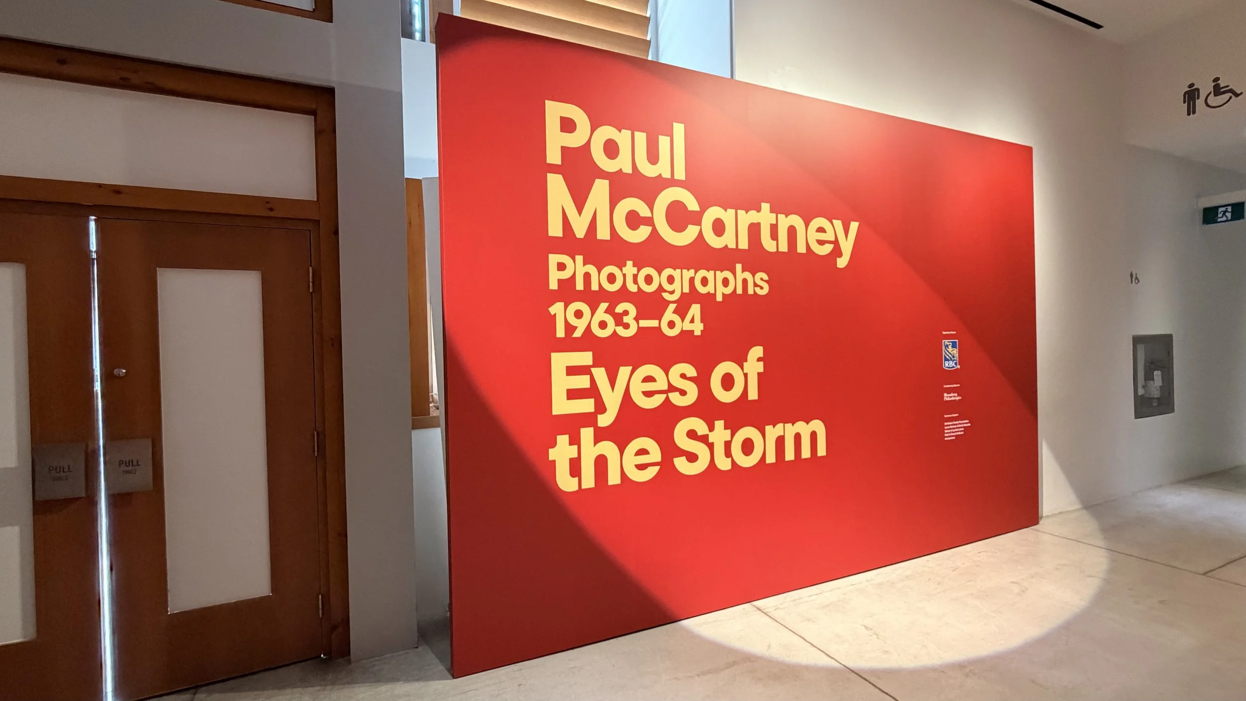
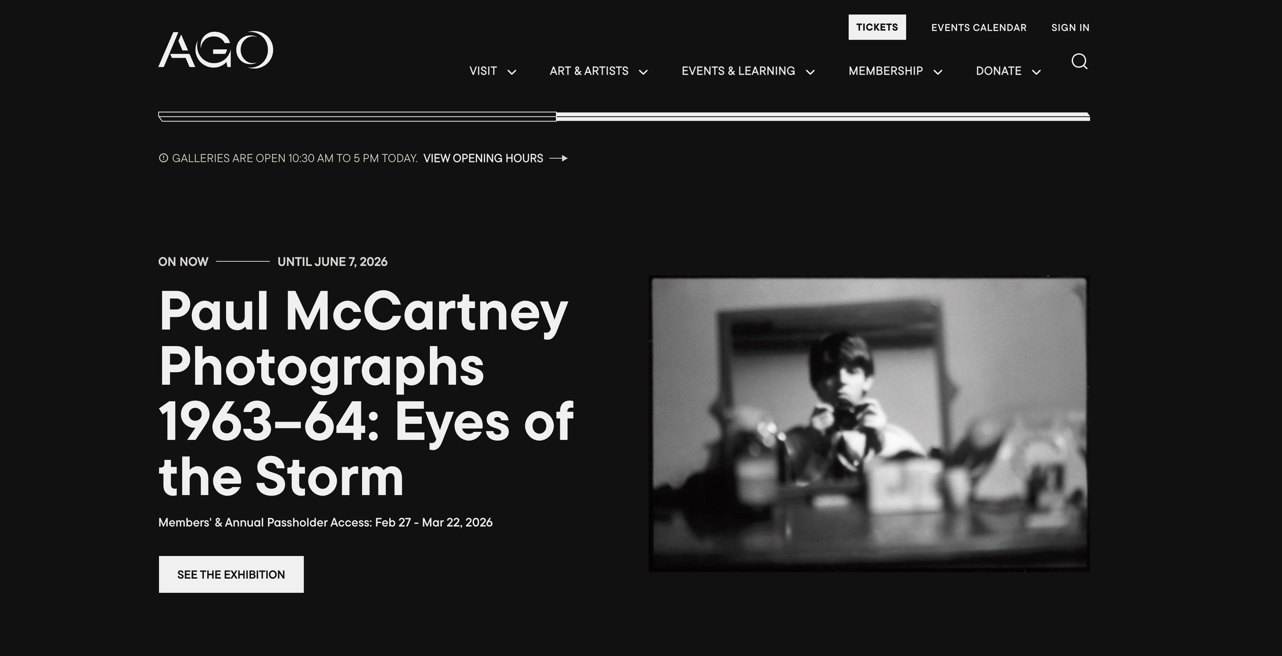
Brand system: Paul MCCARTNEY EXHIBITION AND CAMPAIGN.
I design scalable visual system across exhibition, marketing, and digital touchpoints.
Context
Global cultural figure with strong existing visual associations
A need to balance historical authenticity with contemporary relevance
Campaign required cohesion across digital, print, environmental, and paid media surfaces
REFERENCE AND INFLUENCE
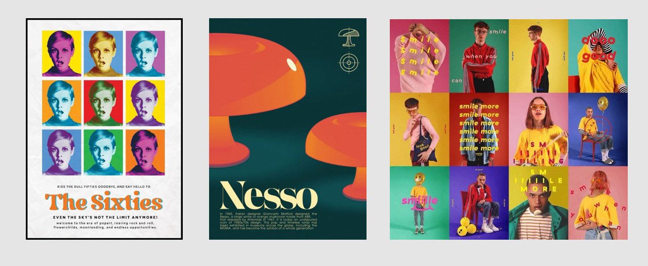
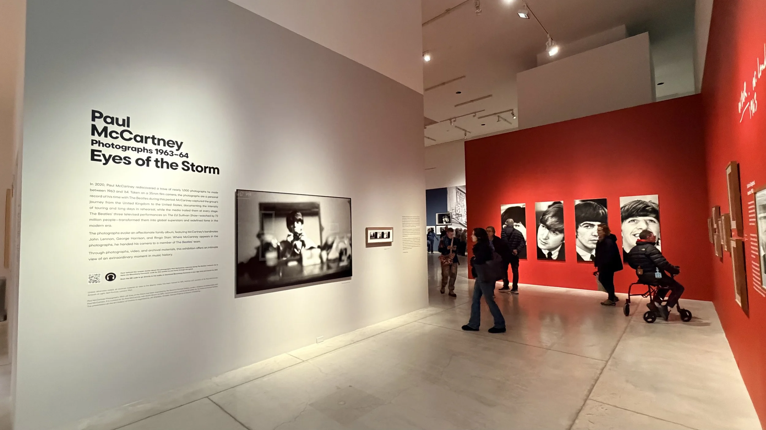
Archival photography aesthetics of early 1960s photojournalism
Contemporary typographic restraint to balance nostalgia
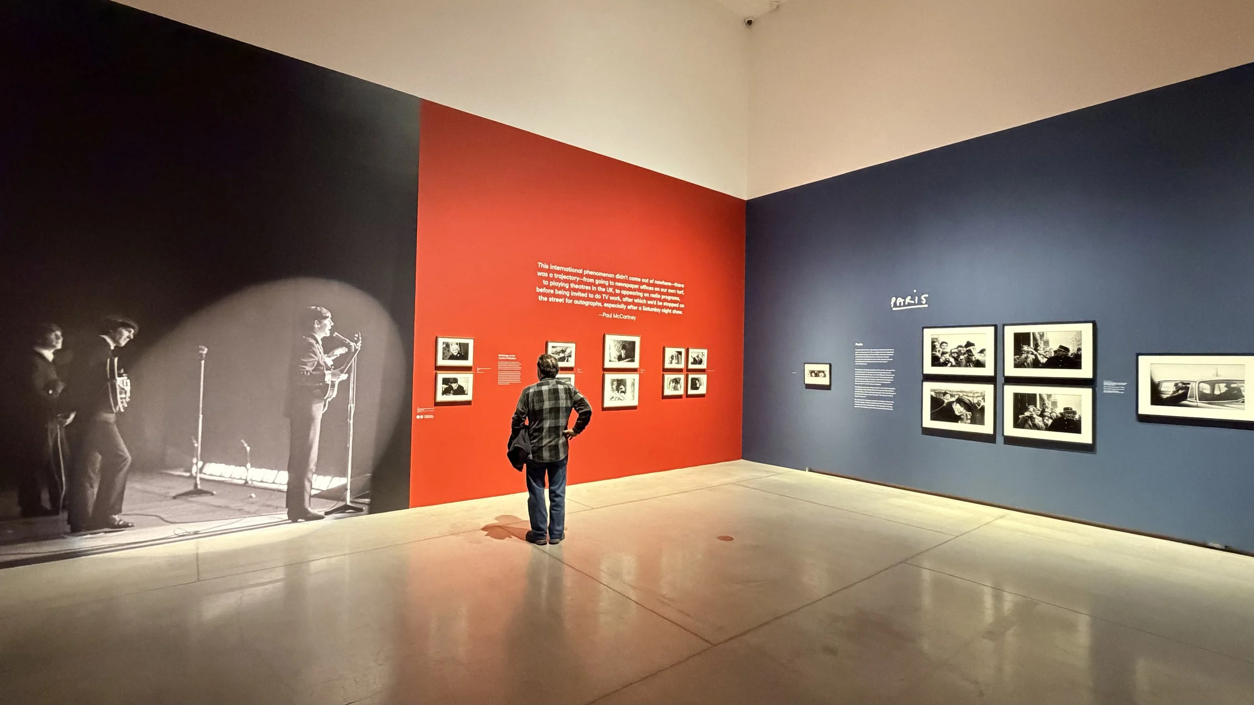
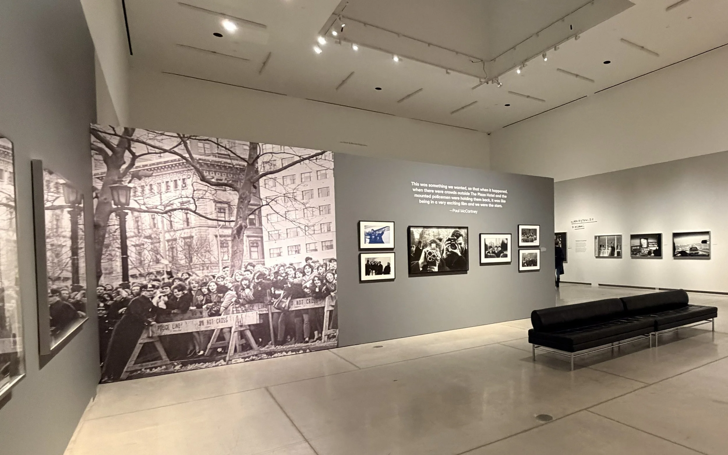
High-contrast color interventions to create temporal tension
Referenced mid-century editorial typography to echo the period while maintaining contemporary legibility standards.
System Foundation
Translate McCartney’s dual identity (musician + photographer) into a unified visual language
Create a flexible system adaptable to exhibition graphics and performance marketing
Develop typographic and color logic that scales across formats
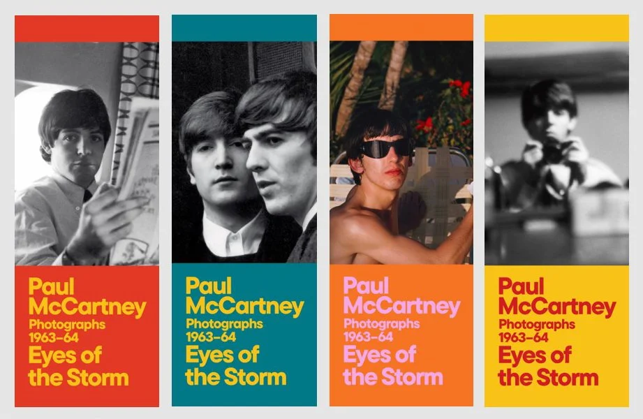
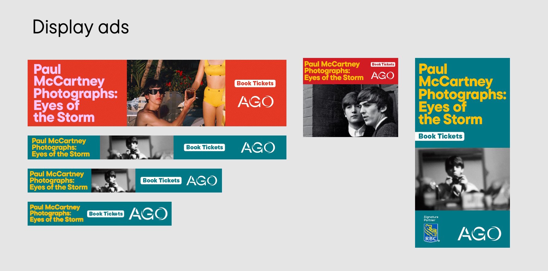
visual system
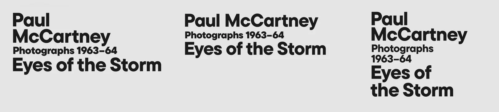
Bold typographic hierarchy
Dynamic composition logic
High-contrast color framework
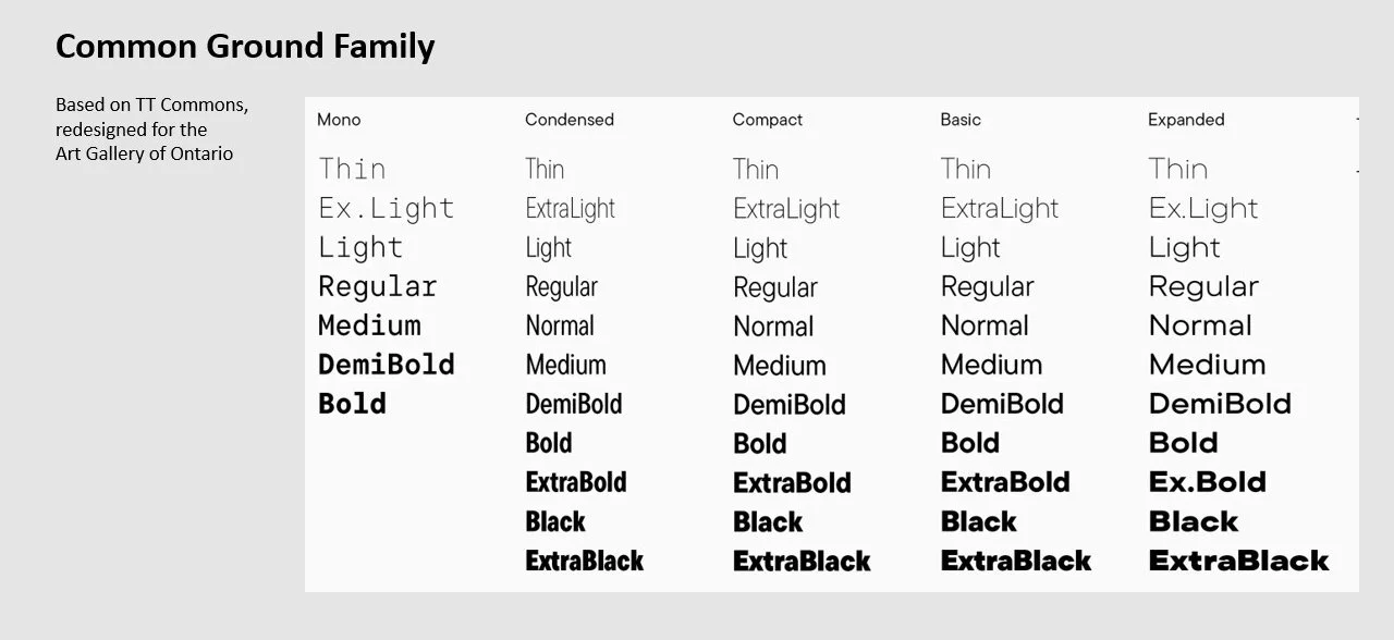
typography
A geometric sans serif selected for clarity, scalability, and legibility across formats ranging from large-scale environmental graphics to mobile-first paid digital assets.
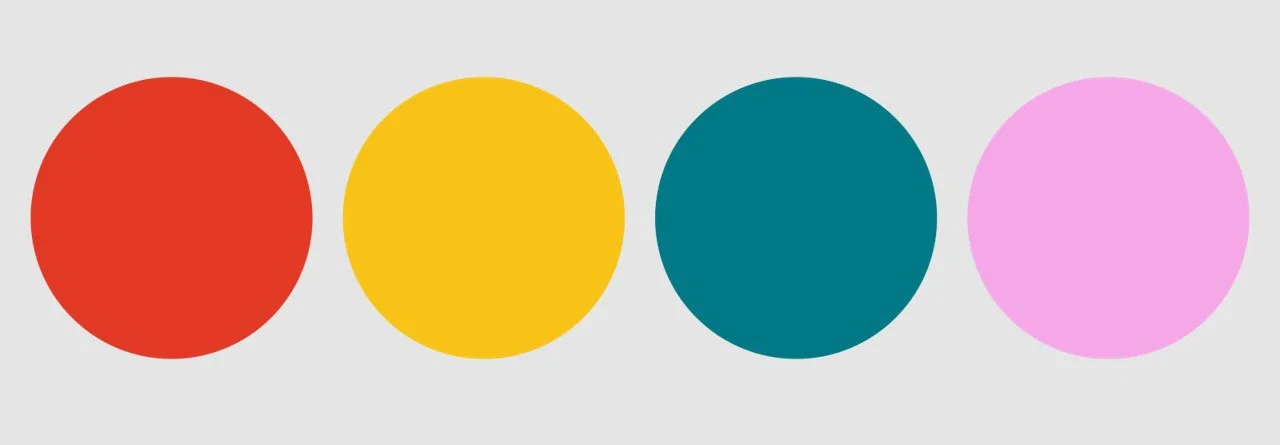
color & composition framework
Color used as memory and temporal marker
Structured grid allowing dynamic placement
Rules for image/text interaction
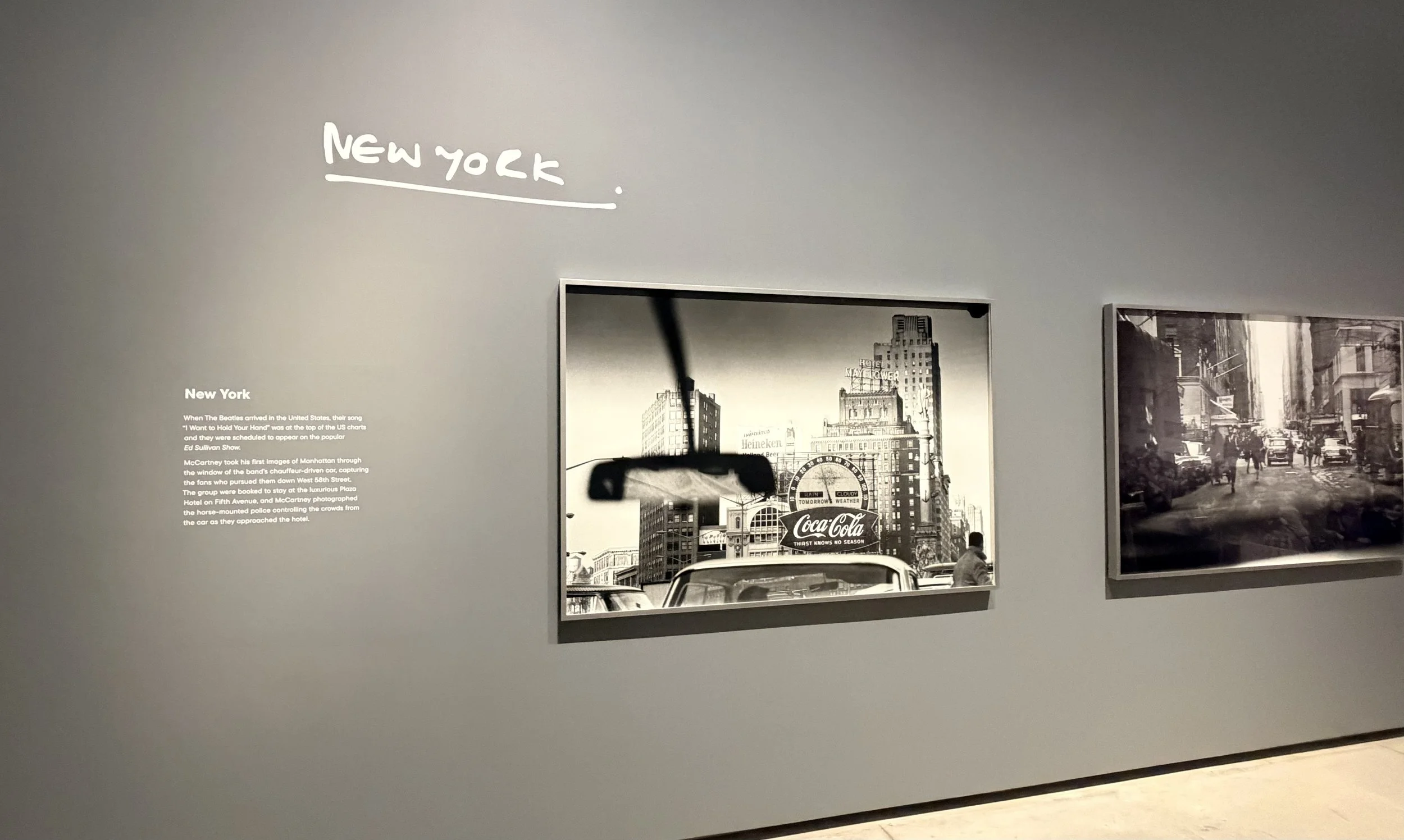
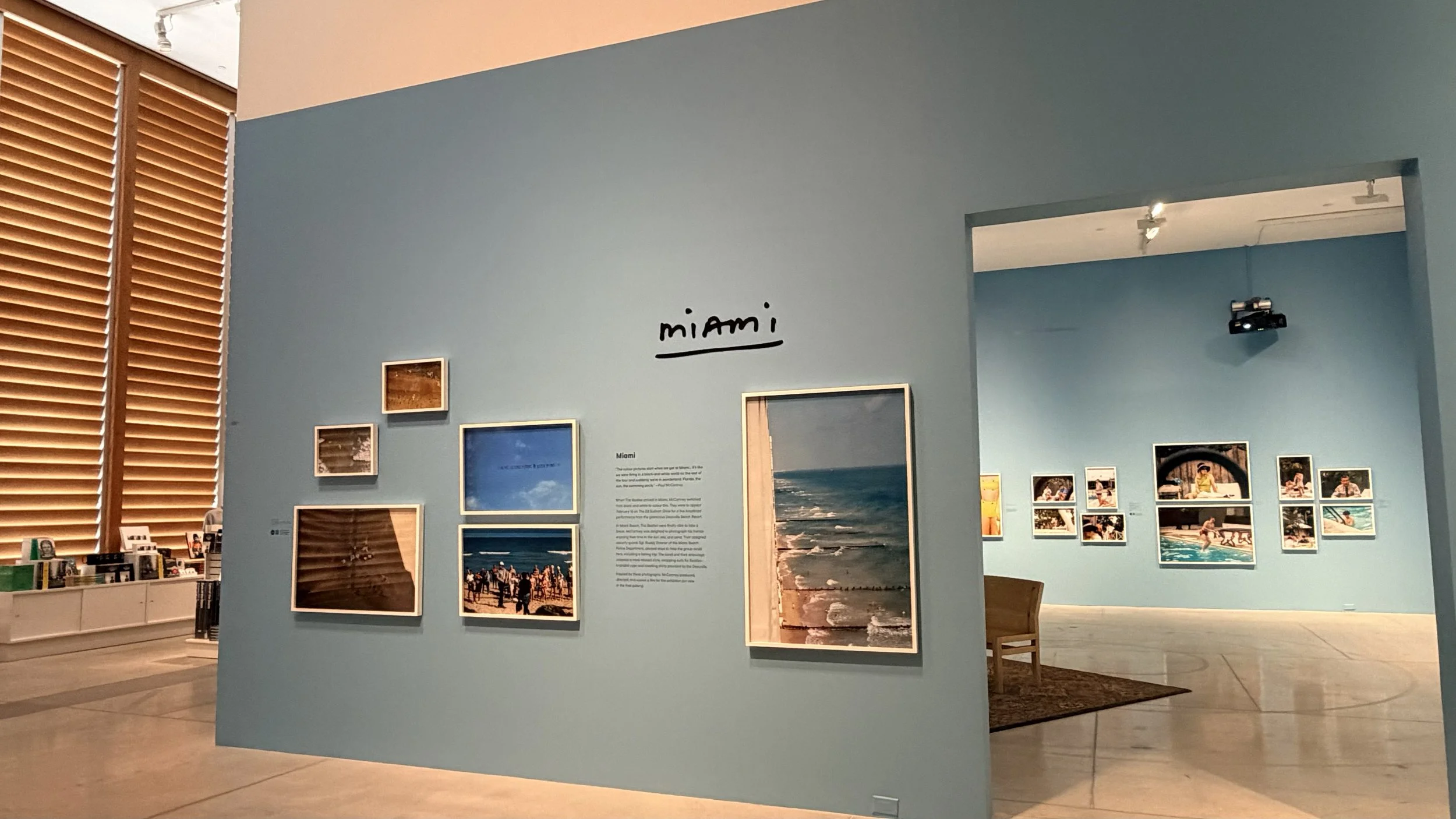
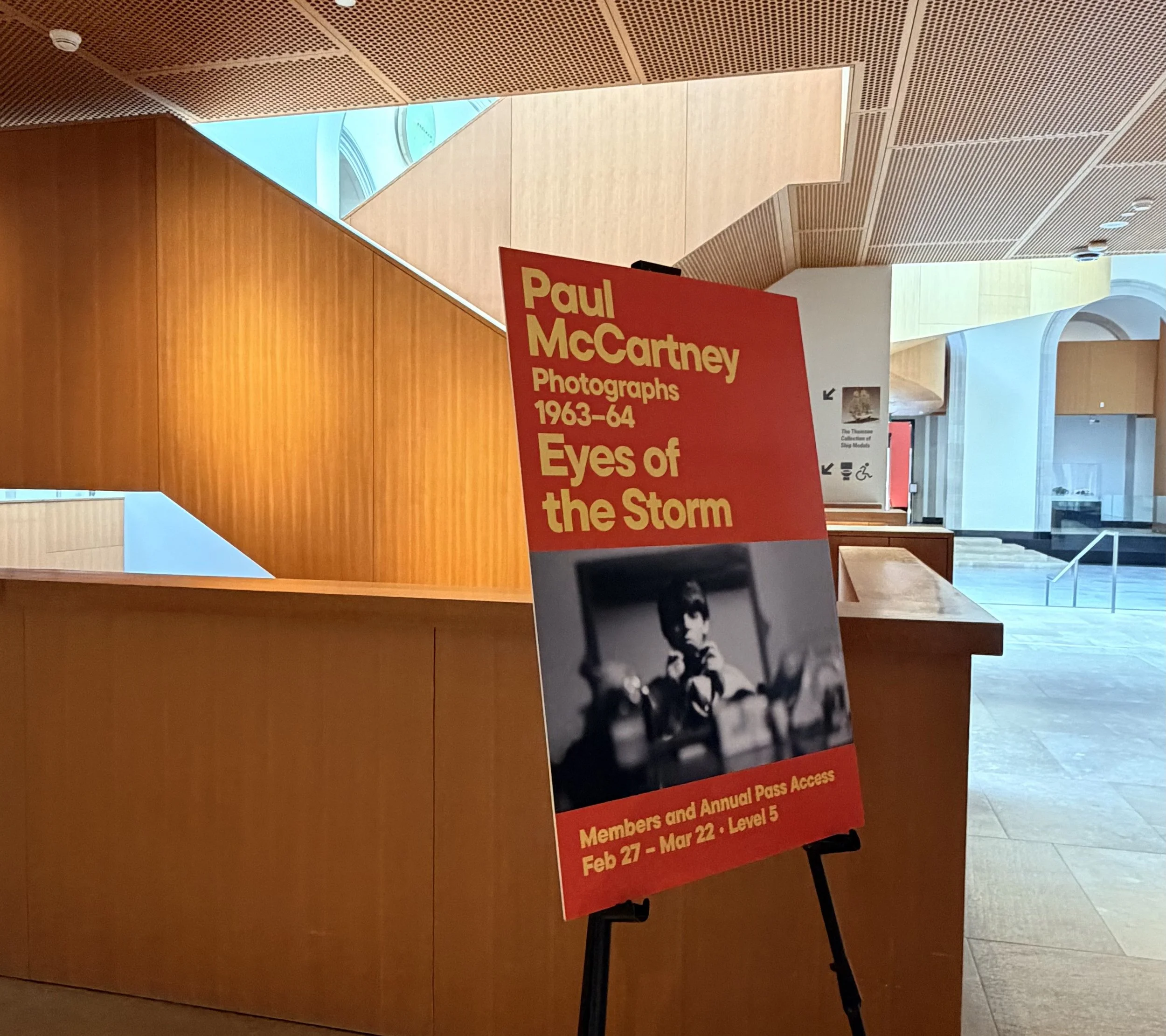
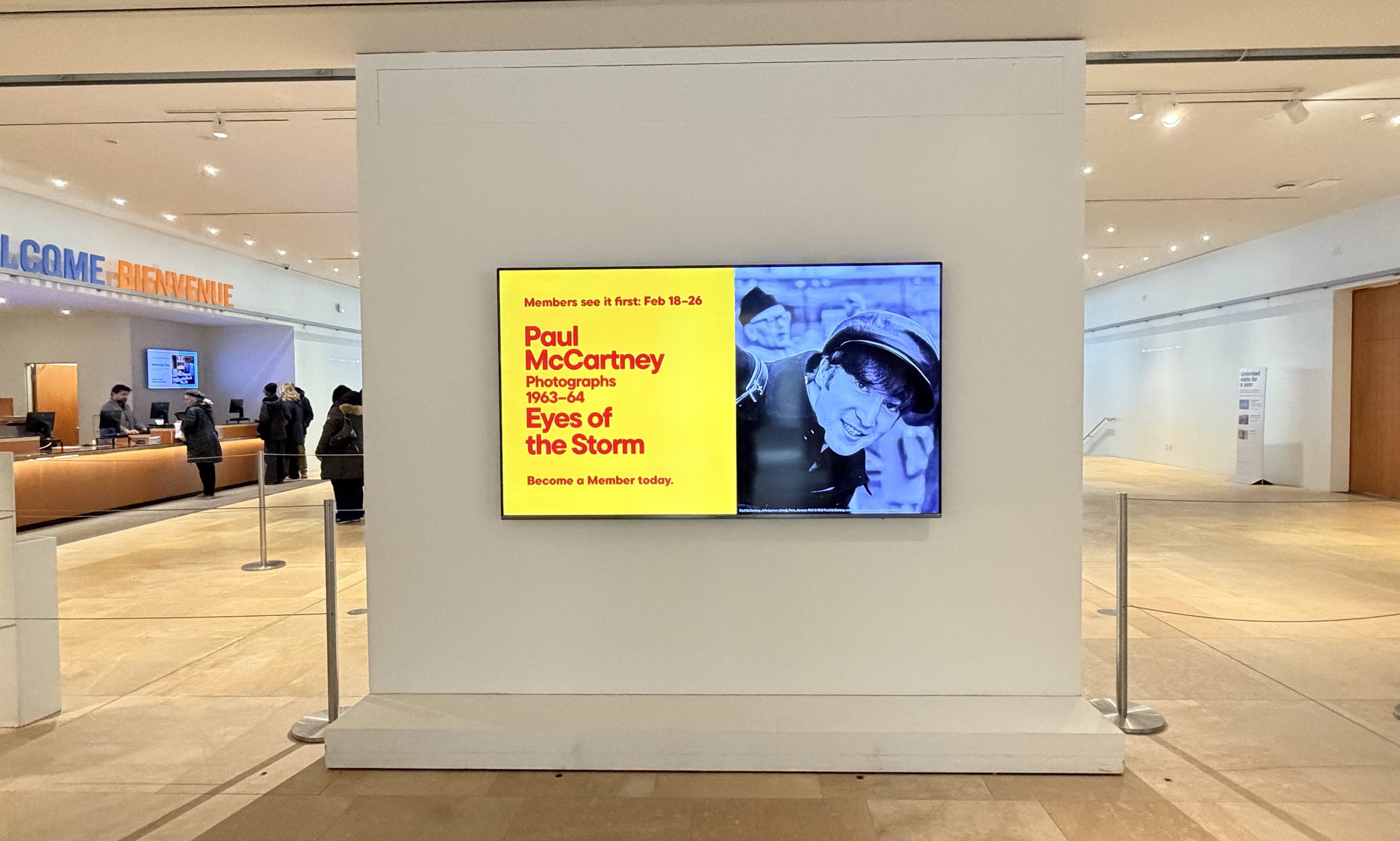
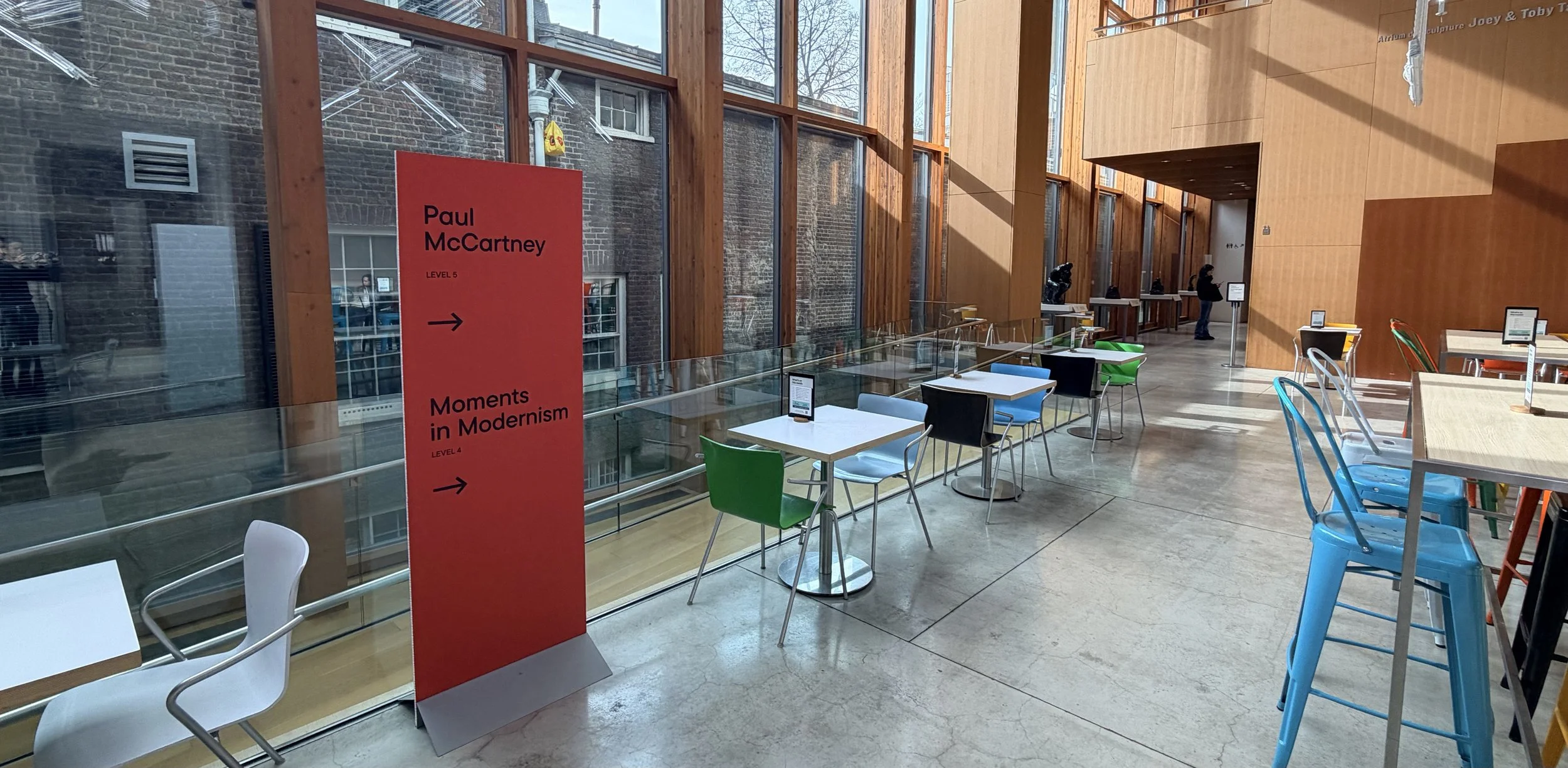
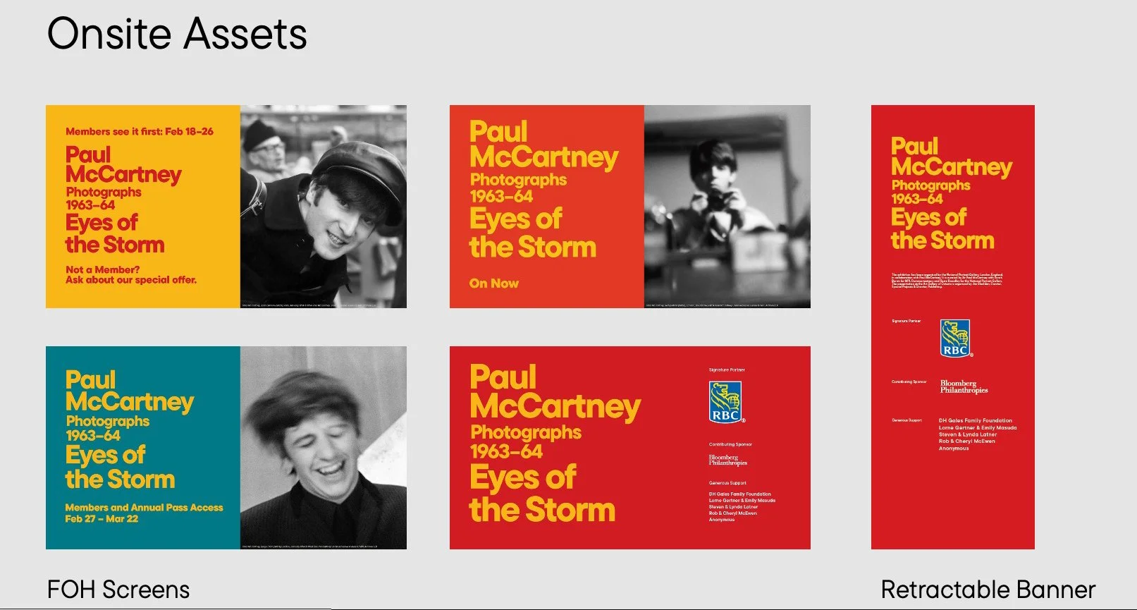
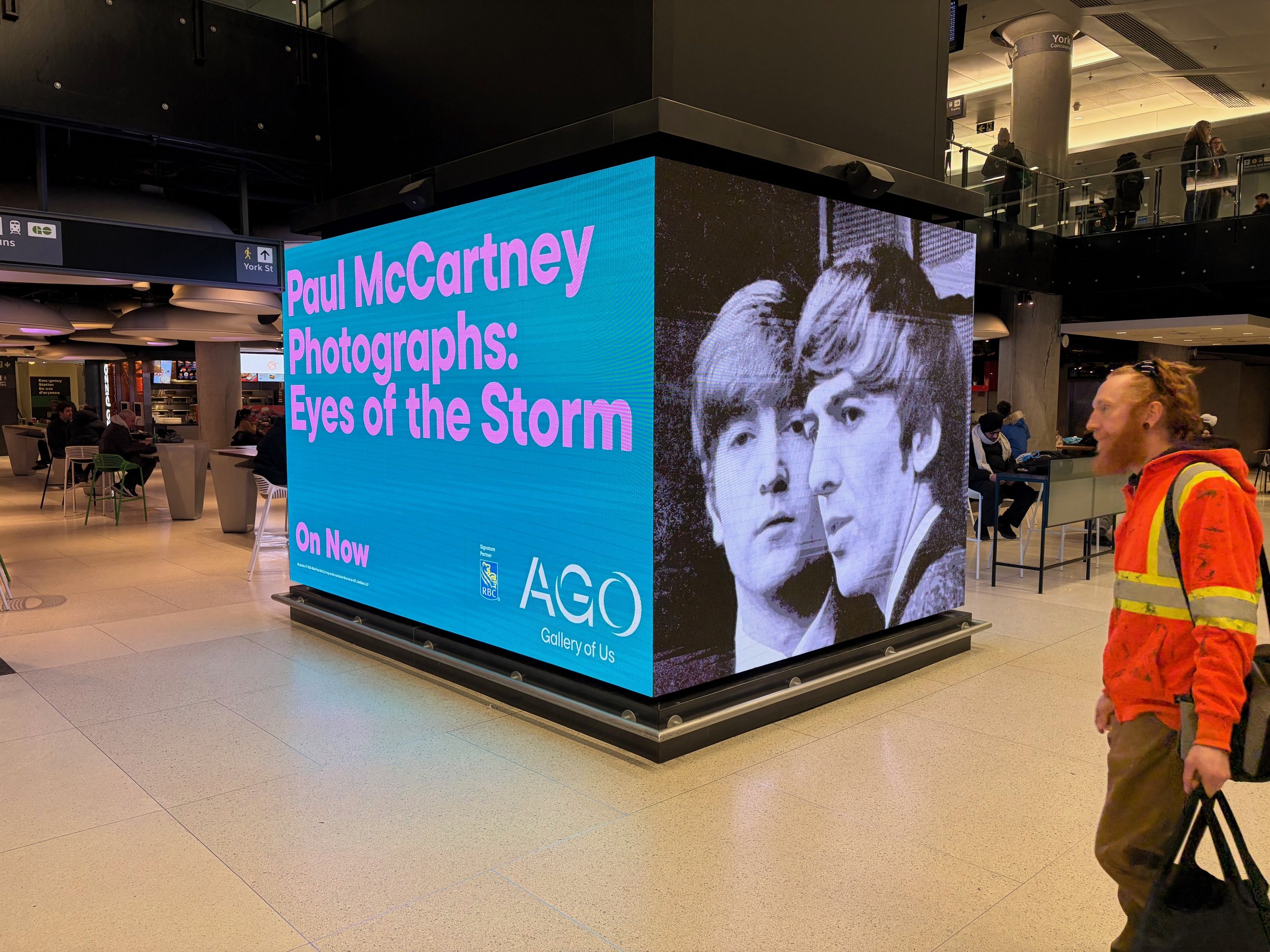
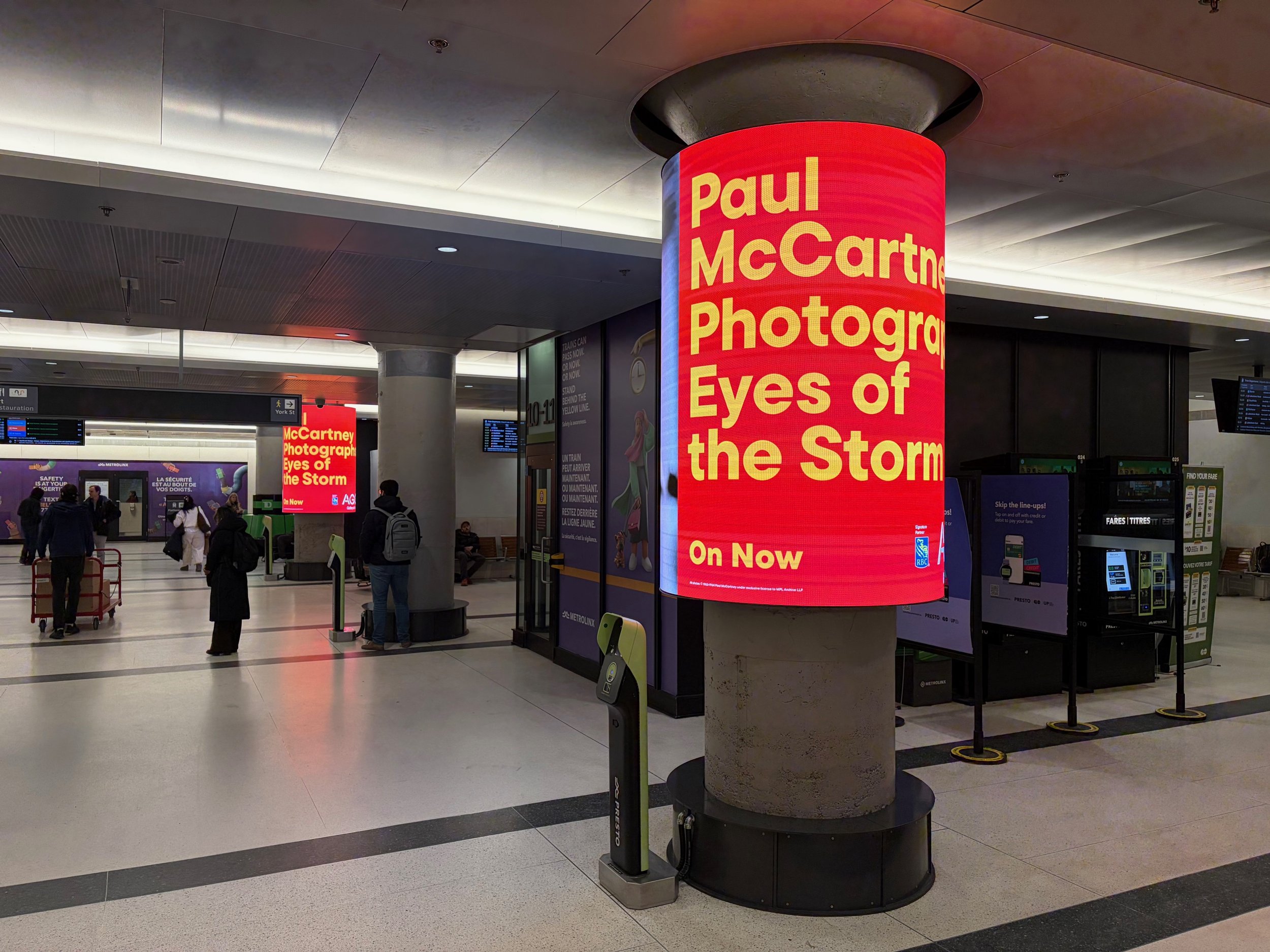
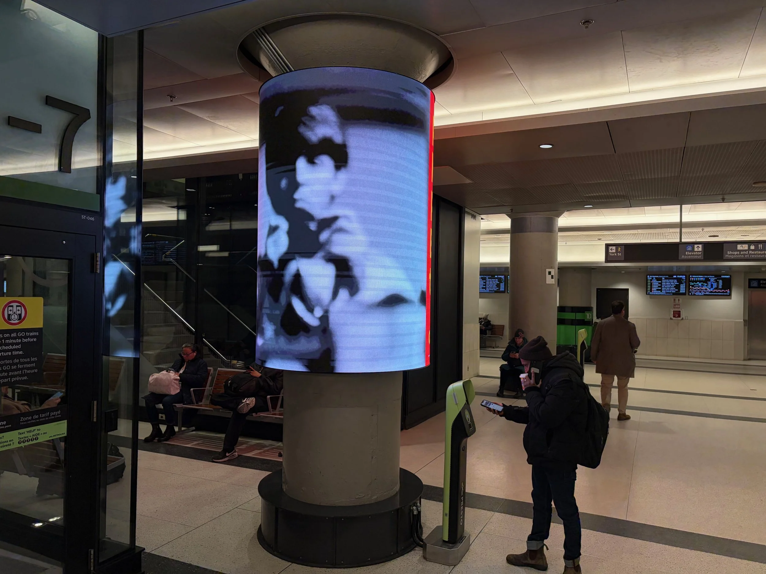
Primary Surface: Exhibition Environment
Modular scaling system
Consistent hierarchy across wall sizes
Accessible readability standards
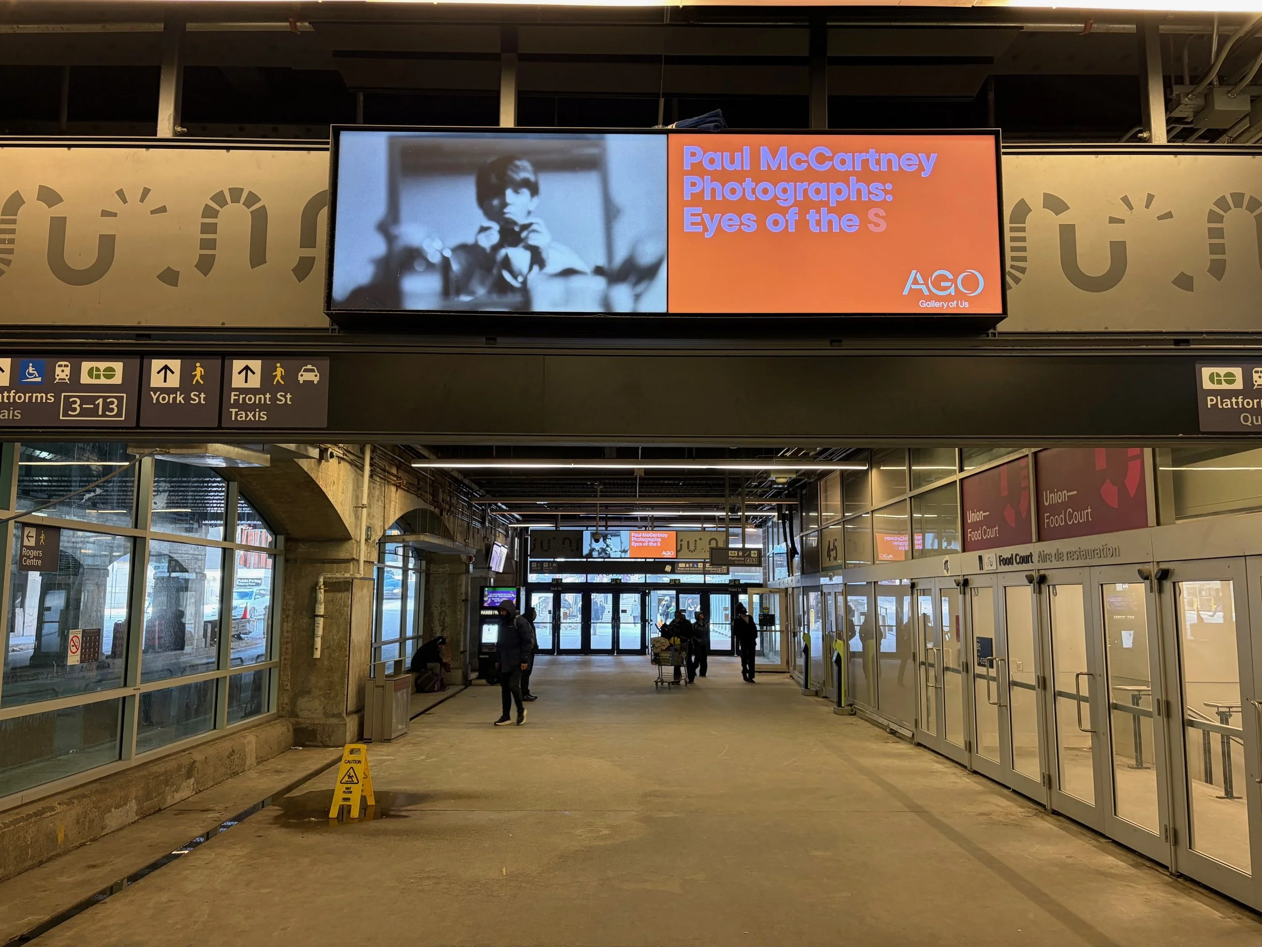
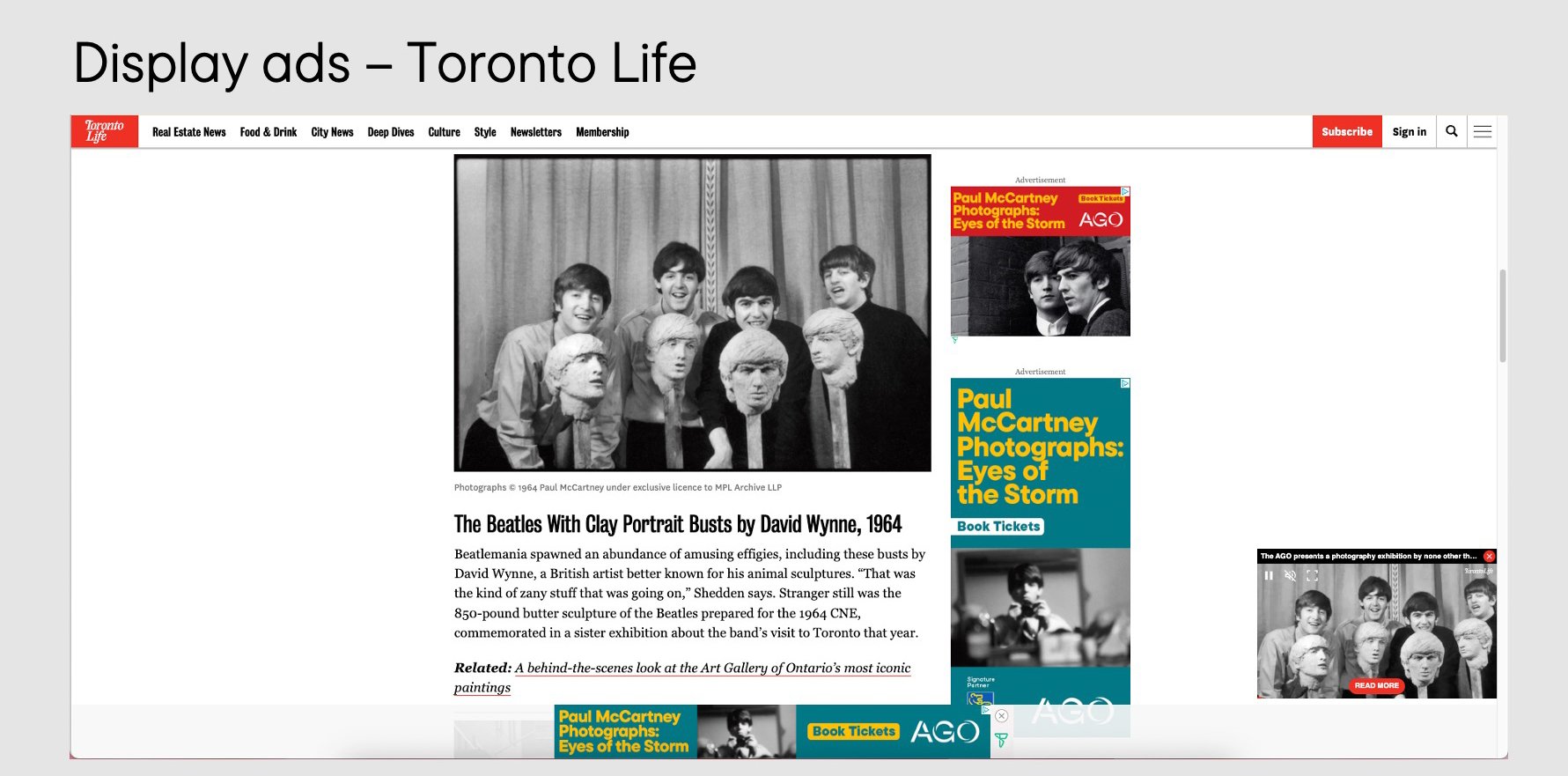
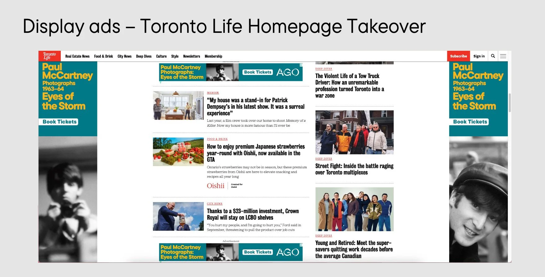
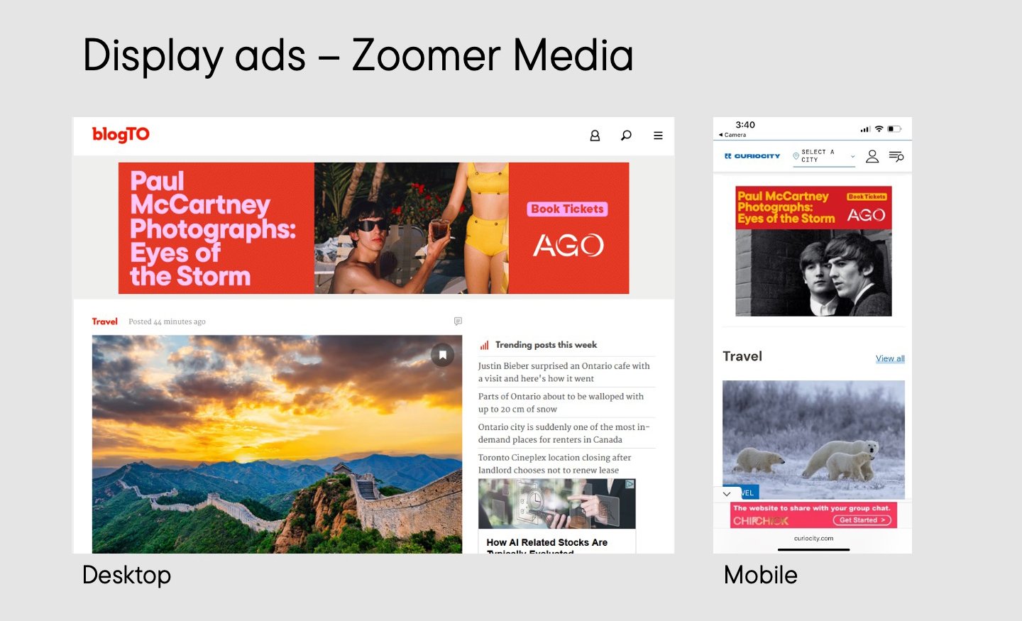
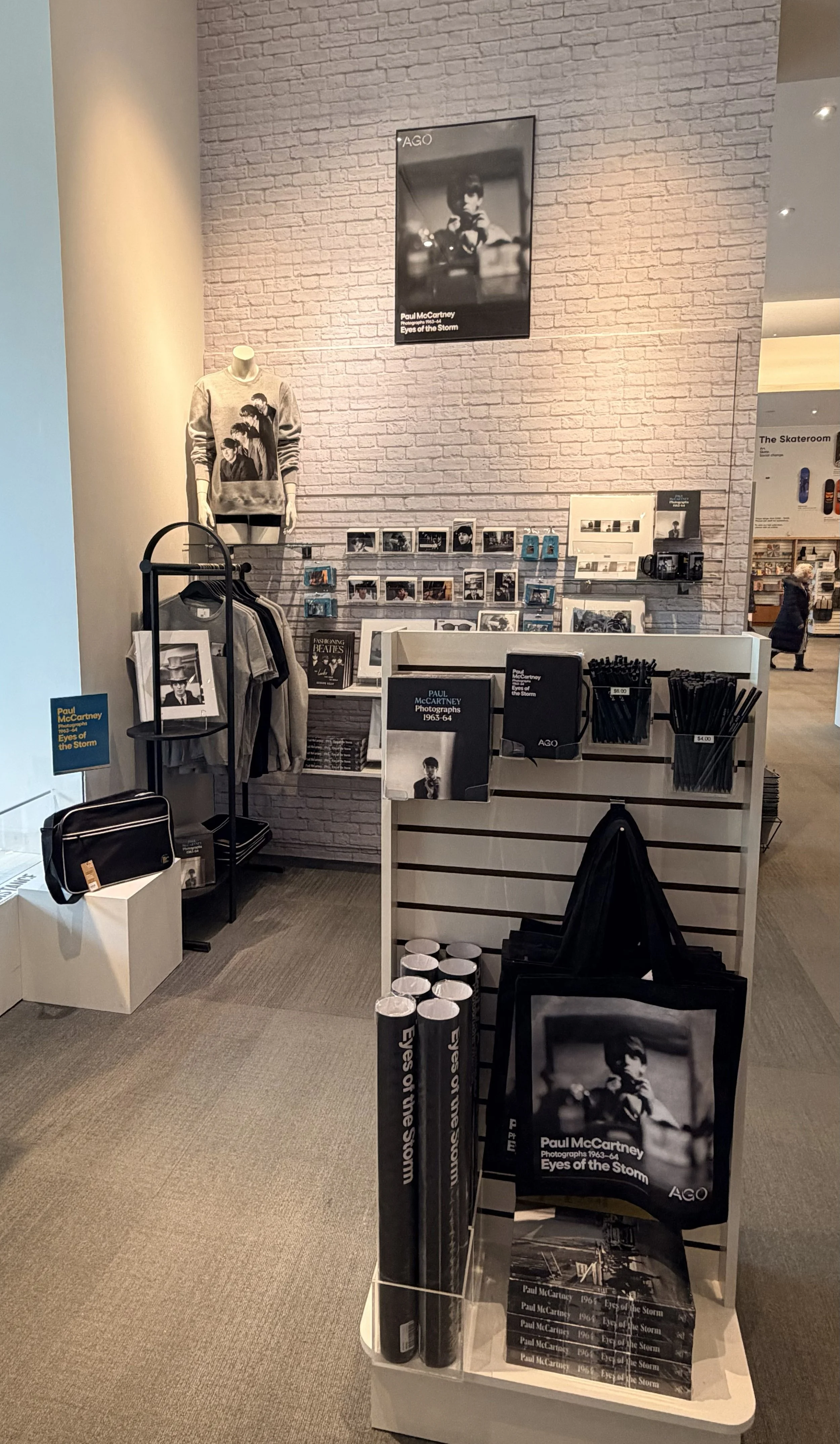
Campaign Extension Across Media
Built a unified asset system supporting pre-launch, launch, and membership acquisition phases.
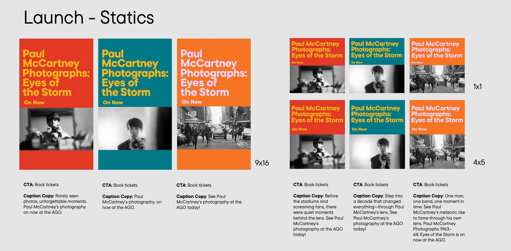
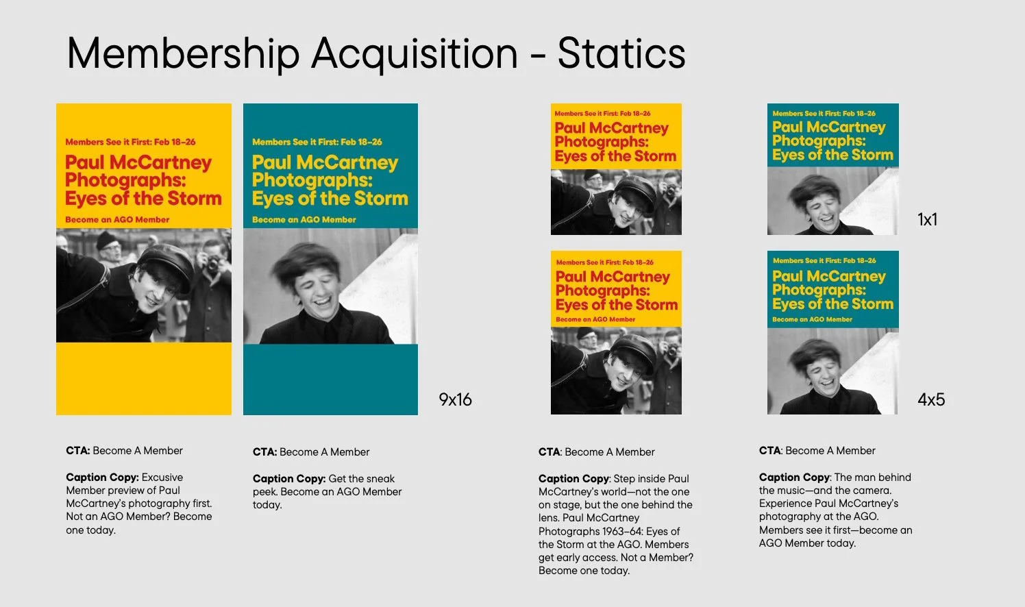
Digital Adaptation
Designed flexible compositions optimized for platform-specific hierarchy while maintaining brand consistency.
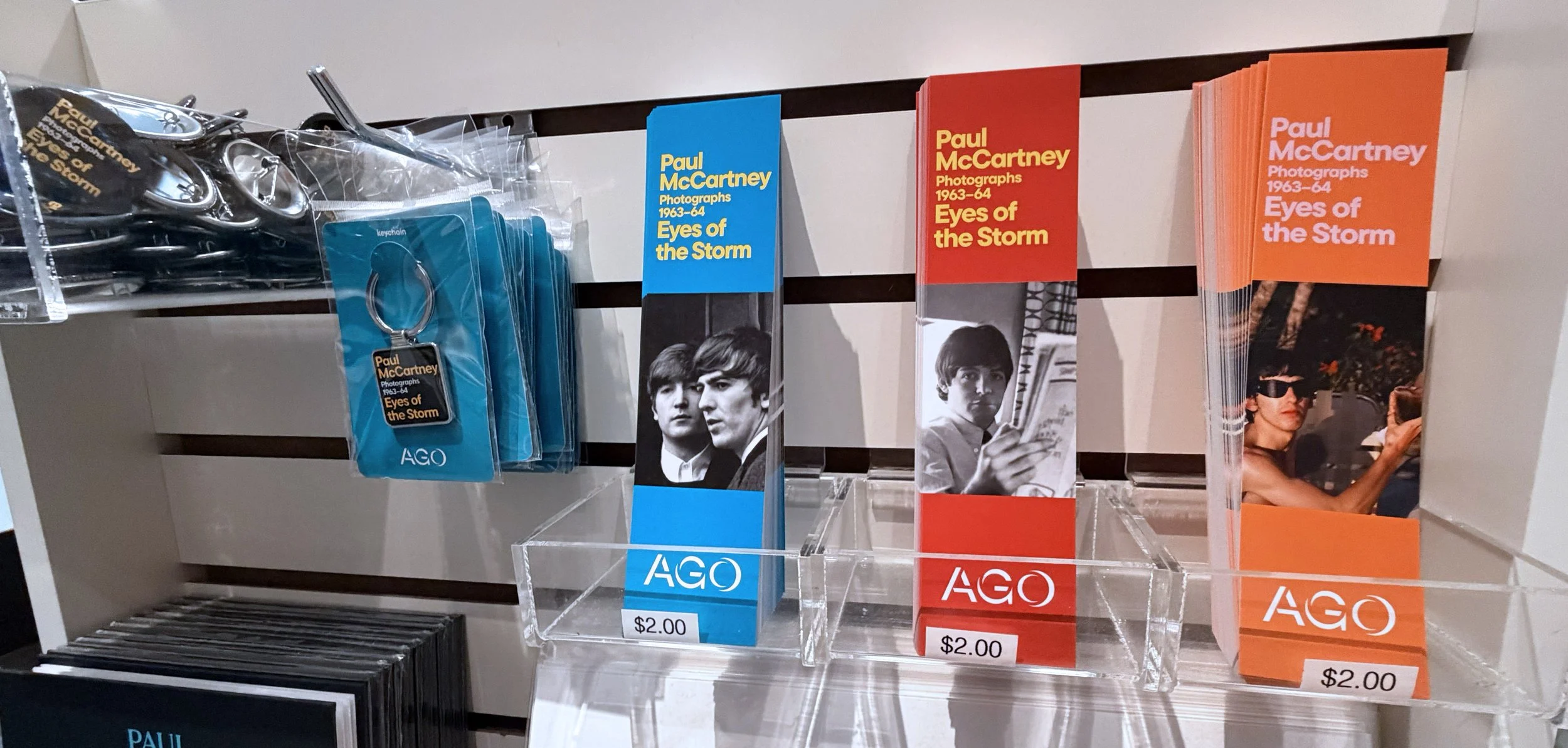
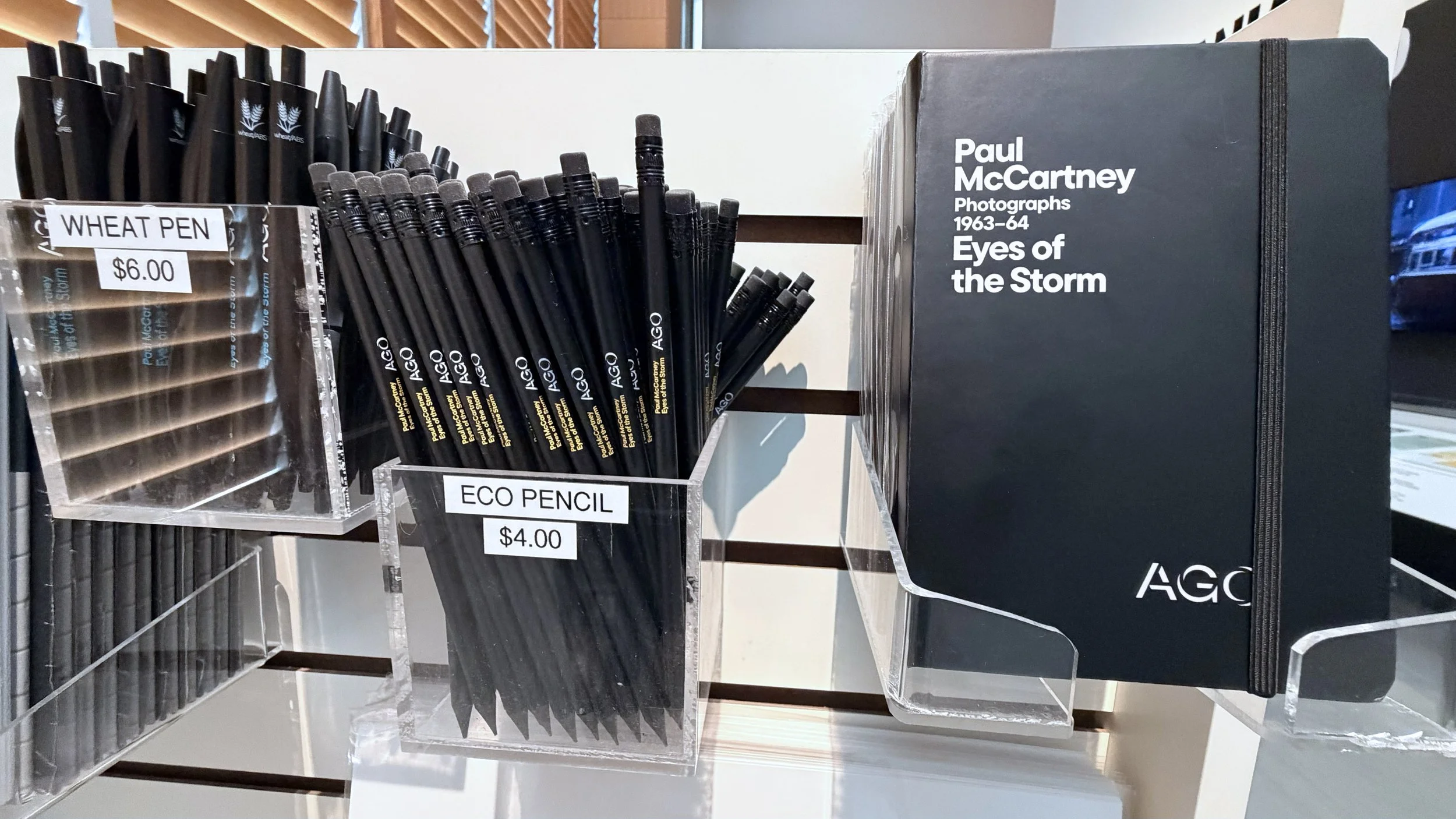
Retail Product Extension
The visual system was extended into retail products, requiring the brand language to function at smaller scales and across varied materials. Designs maintained typographic hierarchy, color logic, and compositional rules while adapting to production constraints and consumer-facing formats.
Scaled system for small-format applications
Maintained visual consistency across materials and finishes
Balanced expressive identity with commercial clarity
System Outcomes
Enabled cross-departmental rollout
Maintained brand cohesion across 30+ asset variations
Balanced historical sensitivity with contemporary expression
Delivered a flexible framework adaptable to future programming
Resulted in a 50% increase in overall sales